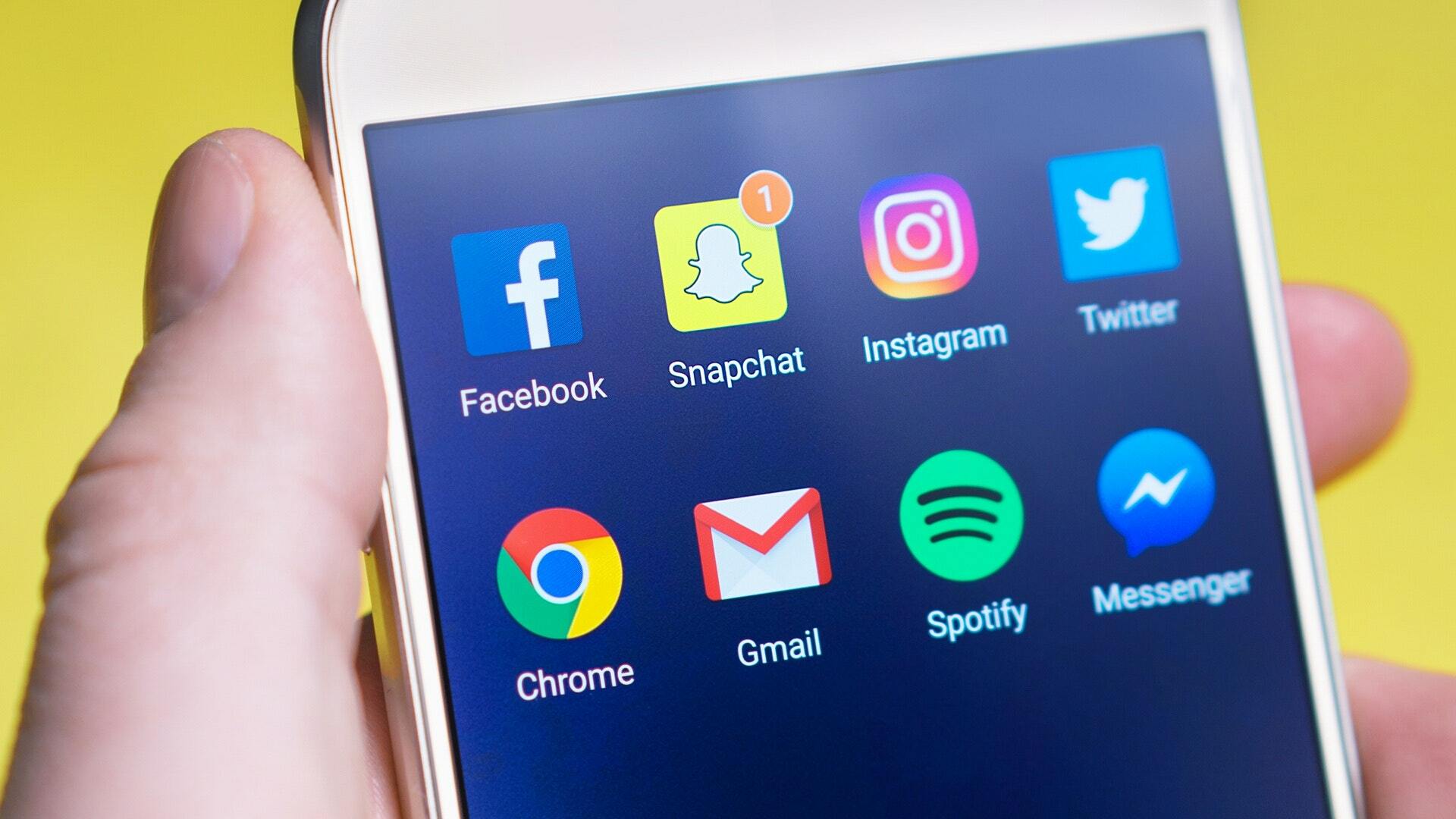
Checking on the current news, more people spend time browsing the internet on mobile devices than on computers.
It is true for mobile devices like smartphones and Tables have overtaken PCs in internet usage. This is because the market for smartphones & Tablets has rapidly grown over years 2014, and 2015. In 2013, a report that was released about smartphones showed that 1 in every 5 people in the world owned a smartphone. In January last year, CNN revealed that mobile devices accounted for 55% of internet usage in the United States. Since then, the Internet has continually been seeing more mobile devices day after day.
 One of the contributing factors is that smartphones have become more powerful with capable processors and big RAMs. This has allowed them to perform tasks, and give an equal result with speed and efficiency the same as PCs. Another factor point to consider is the fact that mobile phones are relatively cheaper than desktop or laptops, and they are more portable than any computer. Just fits into the pocket so perfectly, or you can even carry them by hand, hence the name Hand-held computers.
If you own a website, this facts should ring a bell in your mind, and ask yourself whether your website is mobile friendly?
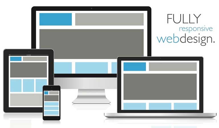
Even though smartphones and Tablets have great power, they are limited to small screens. Most mobile devices have a screen size ranging from 2.5” to 5.0” and Tablets 10.0” or below. While Desktop and laptops feature screen size up to 17.0 – 19.0”, not forgetting that they can be connected to extra-large screens like of Smart TVs and Projectors.
Websites take different forms on different screen sizes. Websites have web pages which are displayed differently on different screen sizes. For instance, Facebook page(s) on a mobile browser sized 4.8” look & feel different when viewed on a computer of screen size 15.7.” Like many other websites, Facebook has made sure that their site is responsive design for an impressive user interface on every device regardless of its screen size.
 Some companies create two versions of their website; one to load on computers and the other on mobile devices. While other companies have even gone an extra mile to create a mobile application version of their website e.g. eBay, OLX.com, FinestAndroid.com etc. That’s a good idea and it’s acceptable, but it is usually time-consuming and very expensive. Furthermore, you have to find expert developers or you will end up getting disappointed.
Creating one perfect, responsive website which loads on different devices is very essential these days. Users are looking for websites that load faster, and don’t require zooming, or double tapping in order to view its content.
Google recently reviewed its search algorithms to favor websites that work smoothly on mobile devices. This implies that creating a responsive website now is not a choice but a compulsory feature! Therefore don’t be left out!